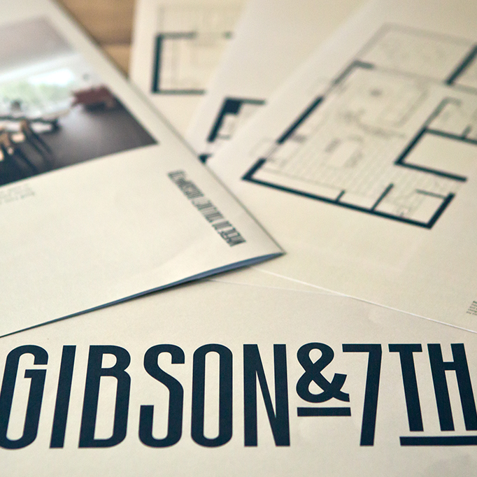
Gibson & 7th Apartments
Real estate development branding
___
Gibson On 7th Apartments
Real estate development branding
___
Client
Bowden Council Adelaide
Year
2014–15
___
Client:
Palladium Aprtments
Year:
2014–15
___
Client:
Bowden Council Adelaide
Year:
2014–15
___
My Role
Art Direction, Typeface Design
Agency
Them Advertising
___
Client:
Palladium Aprtments
Year:
2014–15
___
My Role:
Art Direction, Typeface Design
Agency:
Them Advertising
___
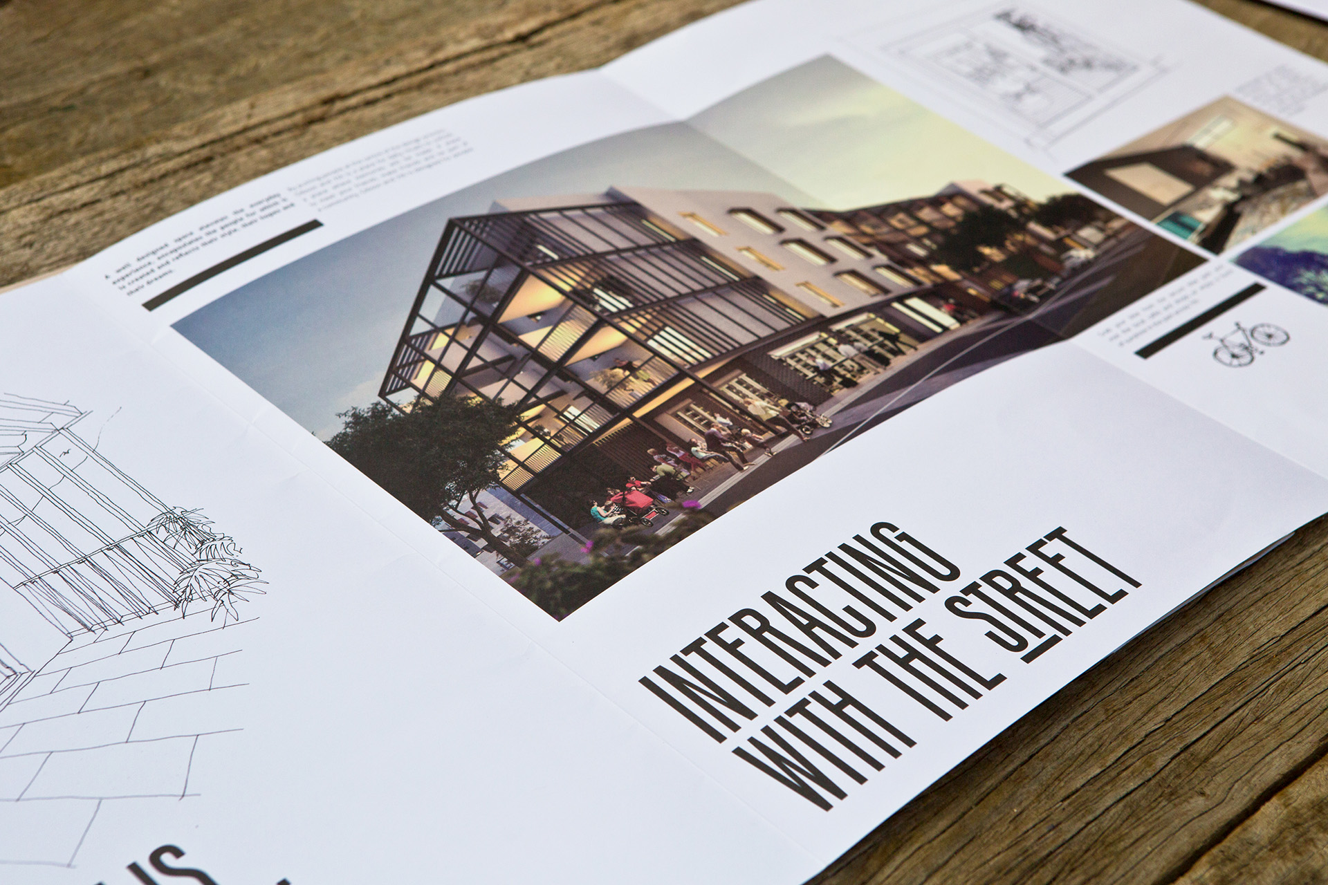
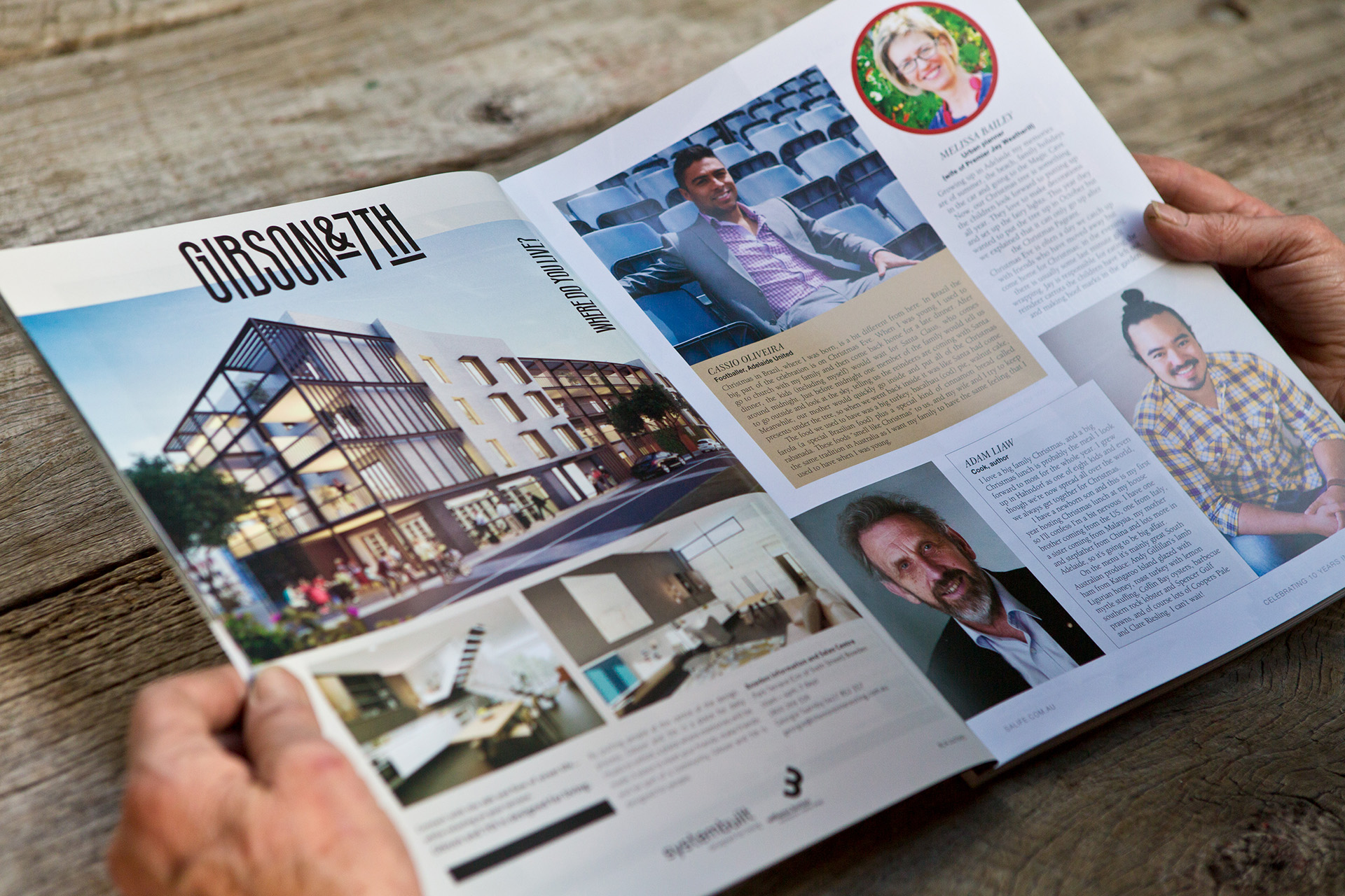
The brief was to establish the brand for a new apartment development at Bowden Adelaide, creating a modern and industrial feel that appeals to young homeowners.
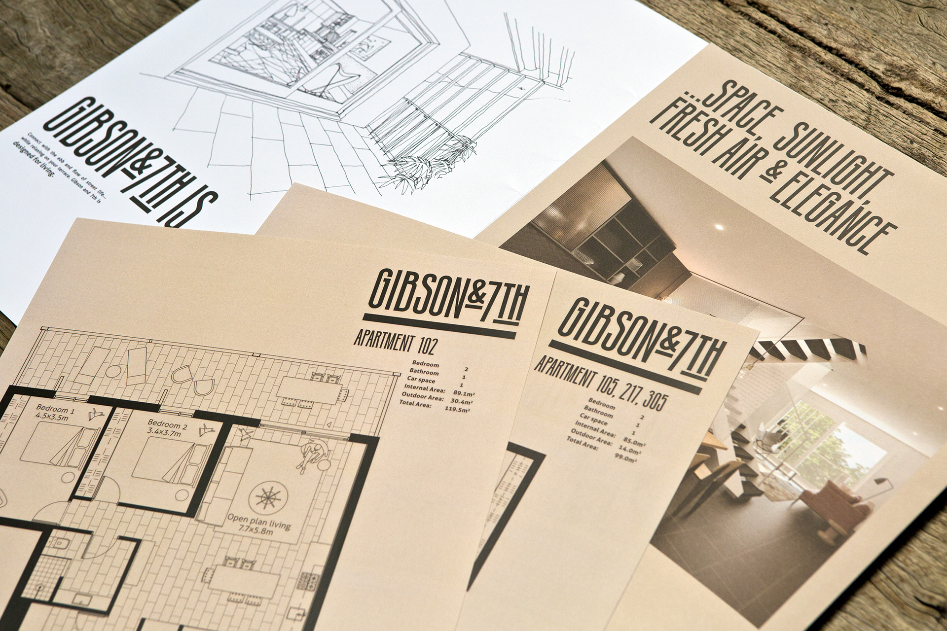
I worked closely with architects and property developers to create a brand identity called Gibson & 7th. I developed a unique typeface for the apartments that reflects the deco heritage of the surrounding area and the structure of the cantilevered balconies.
The brand was supported by a series of brochures and display suite banners, along with floor plans, press advertisements and building signage.
AADC Finalist September 2014
(Adelaide Advertising & Design Club) Print Design – Typography Finalist Award.
Promotional Brochure
Promotional Brochure
Floorplans
Display signage
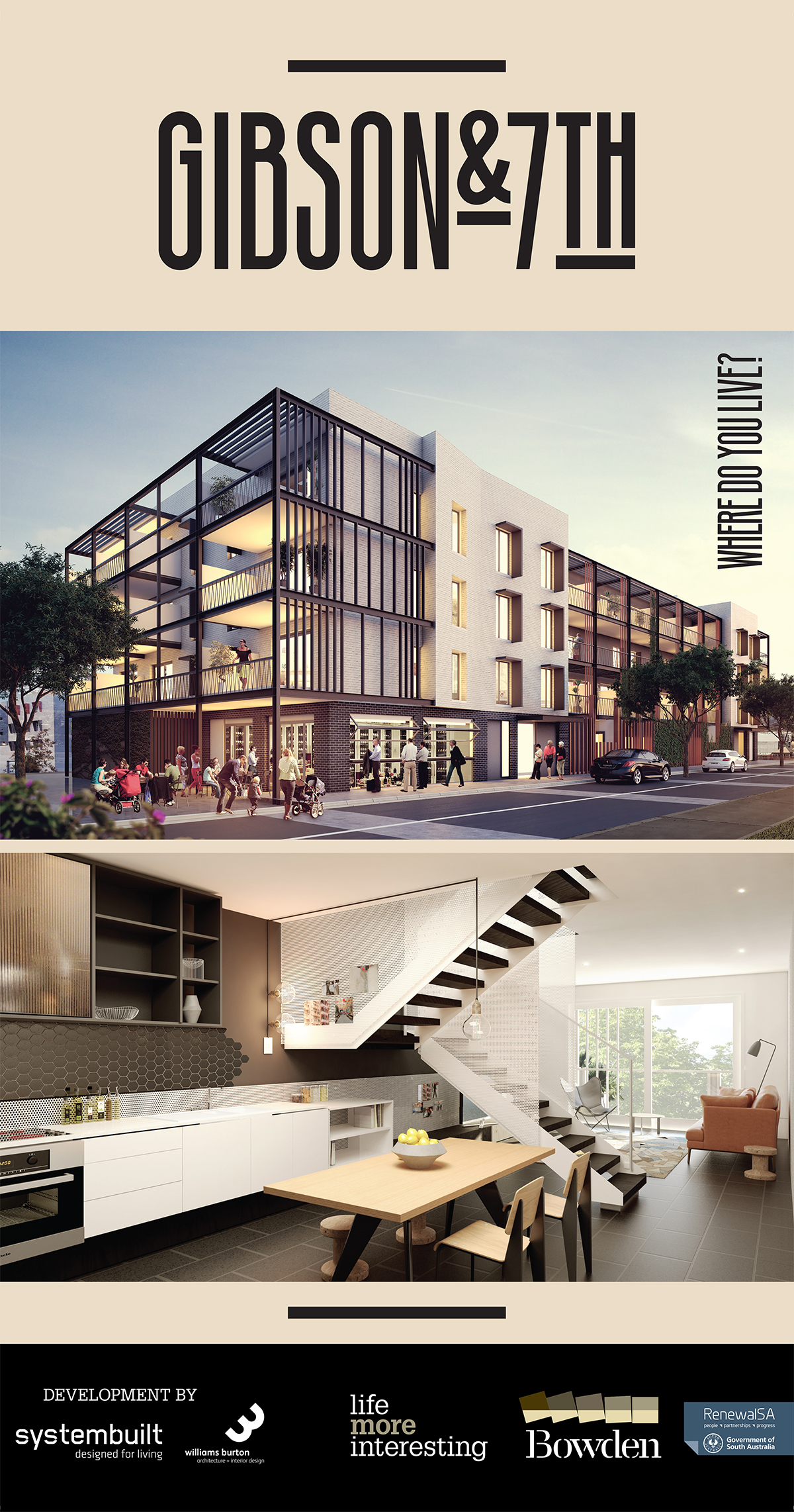
Magazine advertisement
Selected Works
CEFC Brand IdentityBranding

Merchant ApartmentsBranding


Palladium ApartmentsBranding
Gibson & 7th ApartmentsBranding

Mirvac_Annual ReportBranding


POPE Garden ProductsAdvertising